Note
Click here to download the full example code
Plotting with Geoplot and GeoPandas
Geoplot is a Python library providing a selection of easy-to-use geospatial visualizations. It is built on top of the lower-level CartoPy, covered in a separate section of this tutorial, and is designed to work with GeoPandas input.
This example is a brief tour of the geoplot API. For more details on the library refer to its documentation.
First we’ll load in the data using GeoPandas.
import geopandas

path = geopandas.datasets.get_path('naturalearth_lowres')
df = geopandas.read_file(path)
# Add a column we'll use later
df['gdp_pp'] = df['gdp_md_est'] / df['pop_est']

boroughs = geopandas.read_file(geopandas.datasets.get_path('nybb')).to_crs(epsg='4326')
injurious_collisions = geopandas.read_file(
    "https://github.com/ResidentMario/geoplot-data/raw/master/nyc-injurious-collisions.geojson")
Plotting with Geoplot
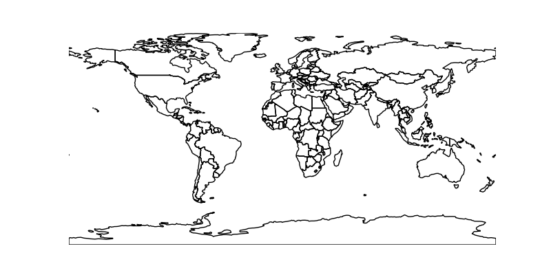
We start out by replicating the basic GeoPandas world plot using Geoplot.
import geoplot

geoplot.polyplot(df, figsize=(8, 4))
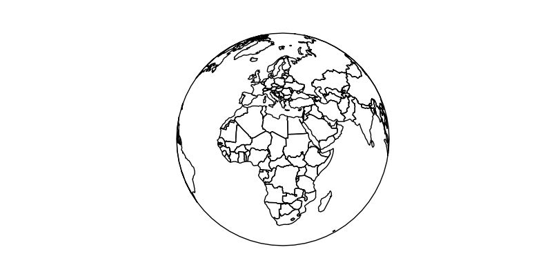
Geoplot can re-project data into any of the map projections provided by CartoPy (see the list here).
import geoplot.crs as gcrs
ax = geoplot.polyplot(df, projection=gcrs.Orthographic(), figsize=(8, 4))
ax.set_global()
ax.outline_patch.set_visible(True)
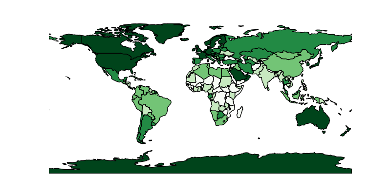
polyplot is trivial and can only plot the geometries you pass to it. If
you want to use color as a visual variable, specify a choropleth. Here
we sort GDP per person by country into five buckets by color.
geoplot.choropleth(df, hue='gdp_pp', cmap='Greens', figsize=(8, 4))
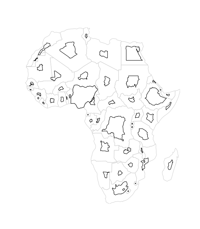
If you want to use size as a visual variable, you want a cartogram. Here
are population estimates for countries in Africa.
geoplot.cartogram(df[df['continent'] == 'Africa'],
                  scale='pop_est', limits=(0.2, 1), figsize=(7, 8))
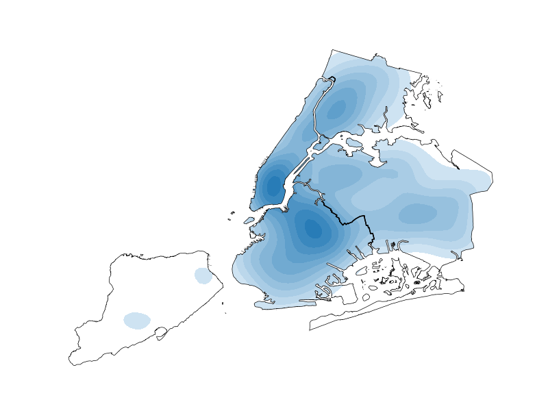
If we have data in the shape of points in space, we may generate a
three-dimensional heatmap on it using kdeplot. This example also
demonstrates how easy it is to stack plots on top of one another.
ax = geoplot.kdeplot(injurious_collisions.sample(1000),
                     shade=True, shade_lowest=False,
                     clip=boroughs.geometry)
geoplot.polyplot(boroughs, ax=ax)
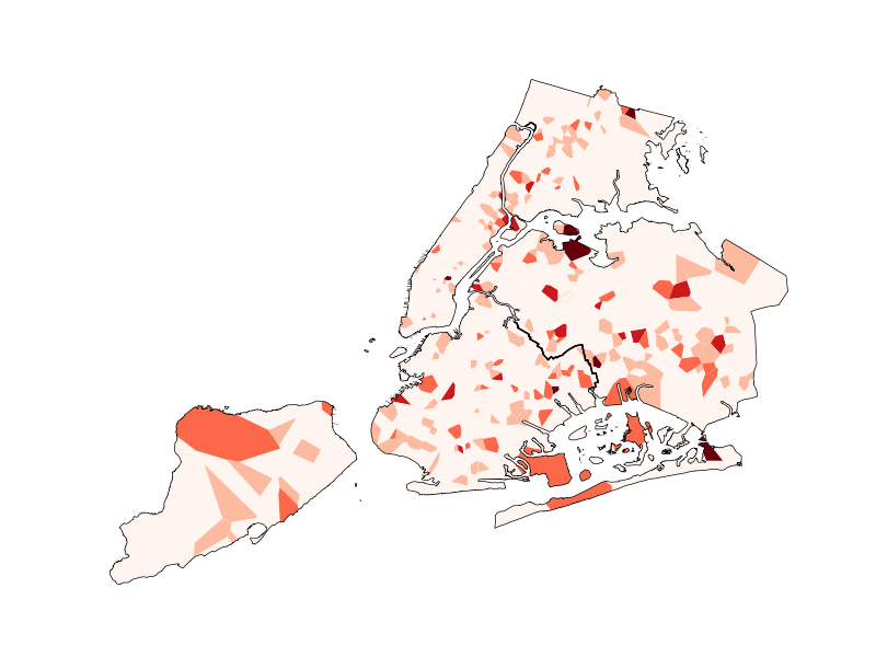
Alternatively, we may partition the space into neighborhoods automatically, using Voronoi tessellation.
ax = geoplot.voronoi(
    injurious_collisions.sample(1000, random_state=42),
    hue='NUMBER OF PERSONS INJURED', cmap='Reds', scheme='fisher_jenks',
    clip=boroughs.geometry,
    linewidth=0)
geoplot.polyplot(boroughs, ax=ax)
Again, these are just some of the plots you can make with Geoplot. There are several other possibilities not covered in this brief introduction. For more examples, refer to the Gallery in the Geoplot documentation.
Total running time of the script: ( 0 minutes 12.008 seconds)